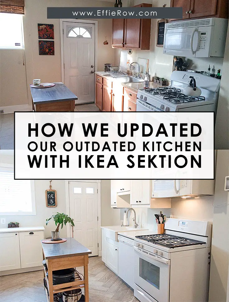
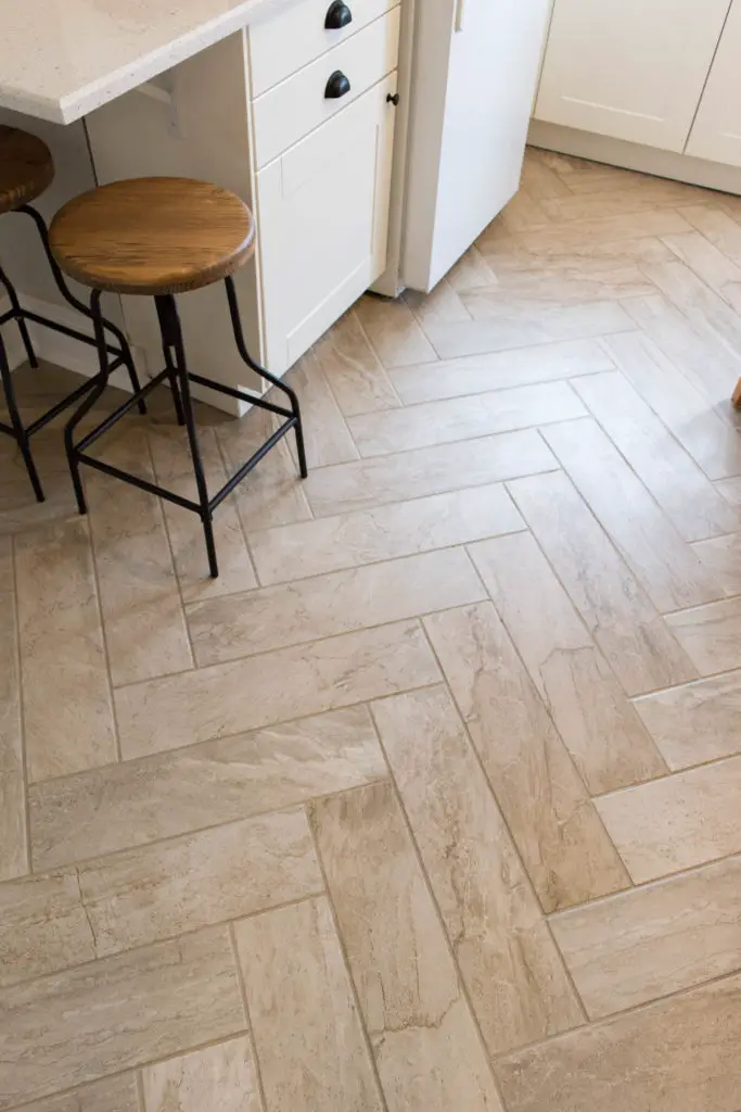
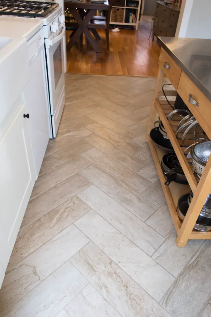
Ikea SEKTION was the perfect choice for our kitchen remodel! We waited over two years to update the space. In that time we discovered ways to make our rowhome’s kitchen more functional and inviting.
DISCLAIMER: This post contains ads and affiliate links. At no additional cost to you, we may receive a commission for purchases made through these links and ads.
I seriously love our kitchen. But that wasn’t always the case.
When I purchased the house, I wanted to immediately remodel the cabinet-lacking, pink-floor-tile, formica-covered, non-opening-window, excessive-bump-out, lack-of-counter-space kitchen. However, a co-worker strongly suggested to me that we wait it out, live in the house, get to know it, and then take on the kitchen.
Ultimately, I headed that advice, and we waited over 2 years before tackling the project. And I’m very glad we did because my initial ideas for the renovation were nowhere near as great as how the end result turned out.
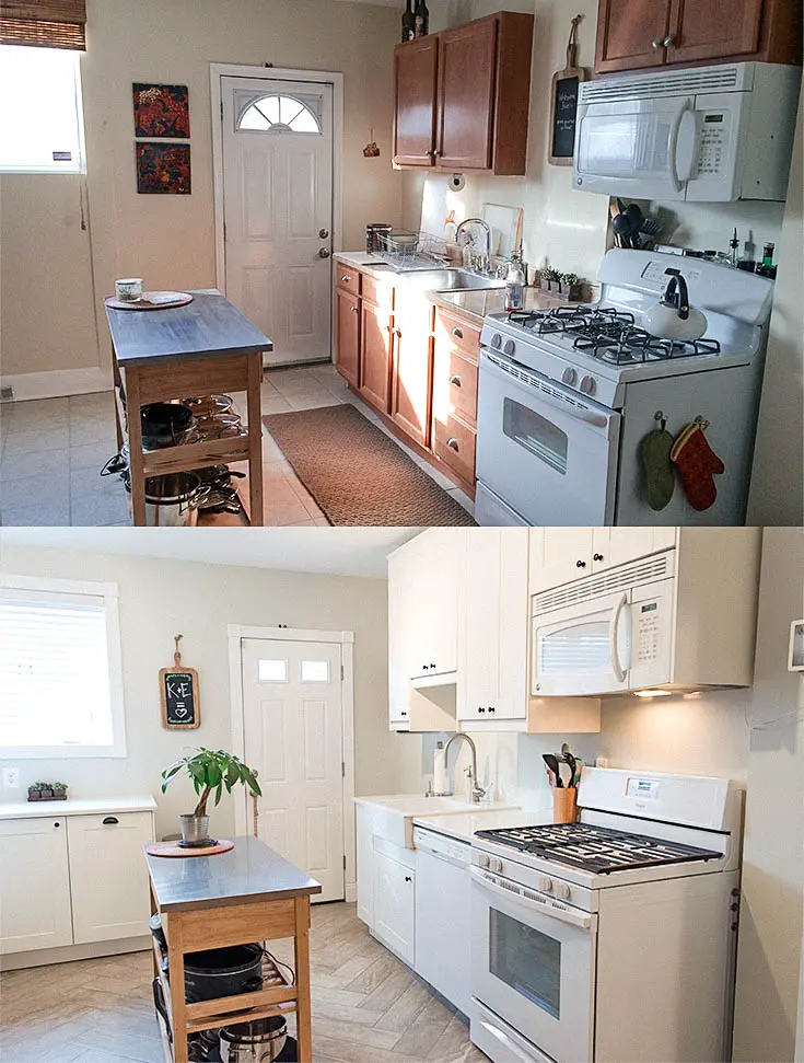
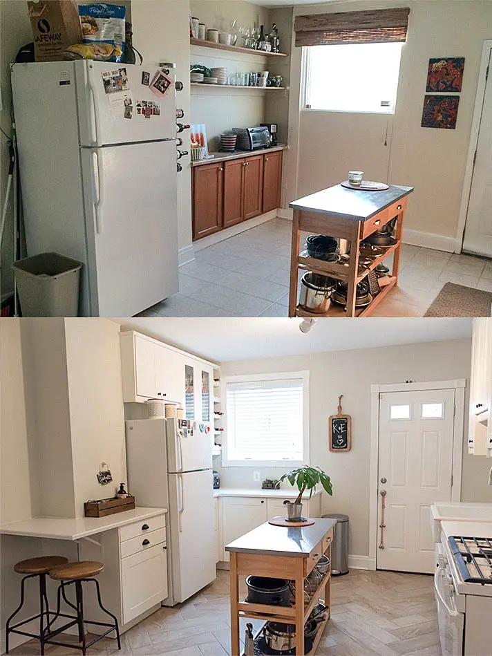
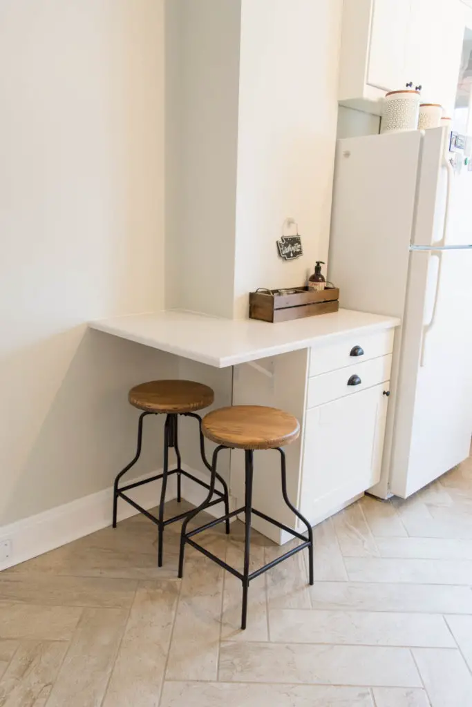
In the time we waited to do the remodel, I thought of several layout and design changes that would greatly improve the function of the space. One of the big changes that I hadn’t initially thought of was moving the fridge to the other side of the old chimney bump-out, and putting a small eat-in area in it’s place.
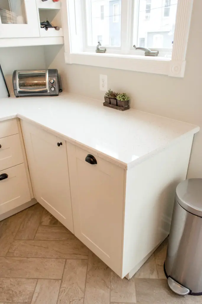
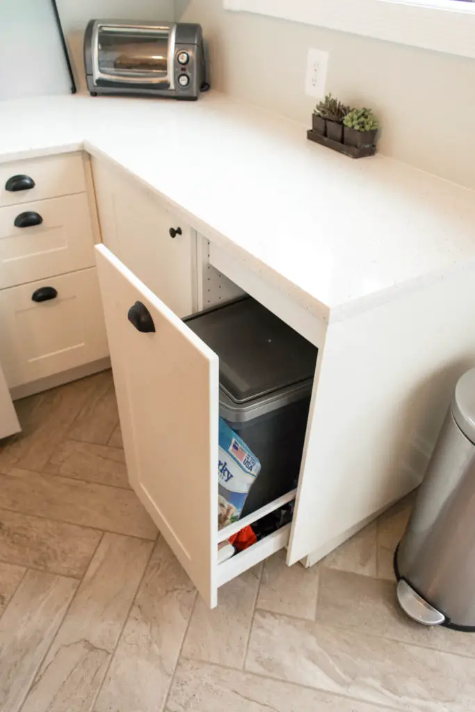
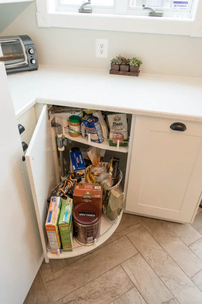
Other layout changes included adding a row of lower cabinets on the back wall (with some awesome storage) and changing out the window. I loved the size of the original window in the previous kitchen, but it was extremely old and full of old dirt and moisture between the panes. Fortunately we found a stock window at Home Depot that was nearly identical in size. When installing it, we had our contractor lower the position for a more functional view.
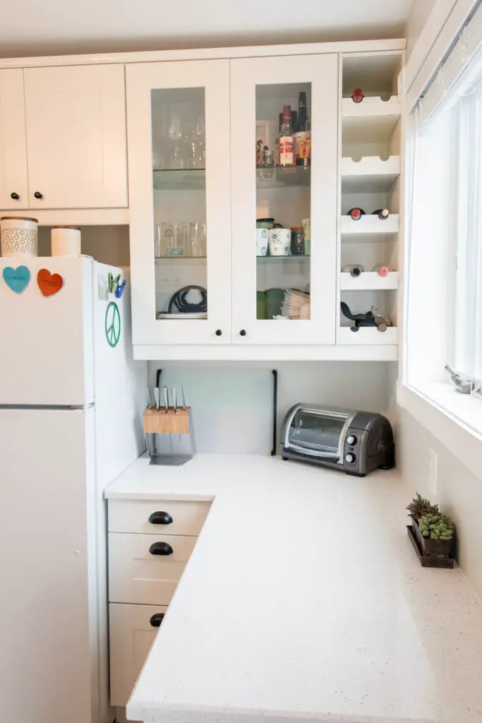
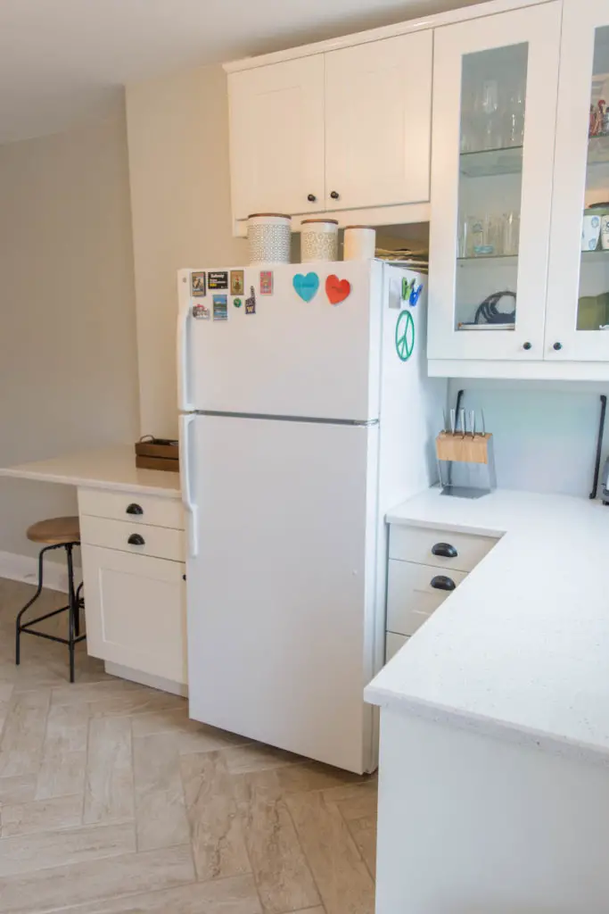
One of my favorite features of the kitchen is our mini eat-in area. When designing the space, I had to do some serious convincing with Eric that it would be functional. He had his doubts for the right reason, but I’m happy to report everyone loves the end result. We get plenty of use out of it. Whether it’s having friends over for drinks, or a quick breakfast, it definitely invites people to take a seat.
We used 40″ cabinets everywhere except for over the appliances and the sink.
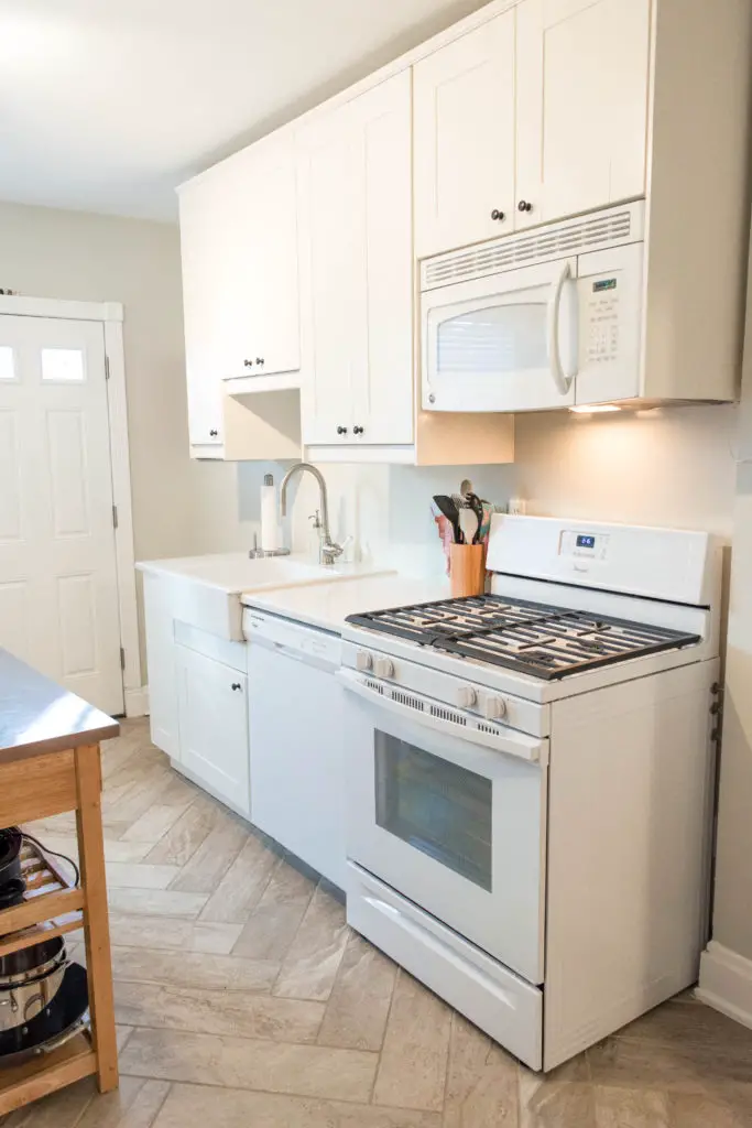
Another one of my favorite features (one of about 12 favorite things..!) are the floors. These are <$2 sq/ft ceramic tiles from the HD (!!!) and yet they look like a million bucks (IMO). Not to mention they hide dirt extremely well.
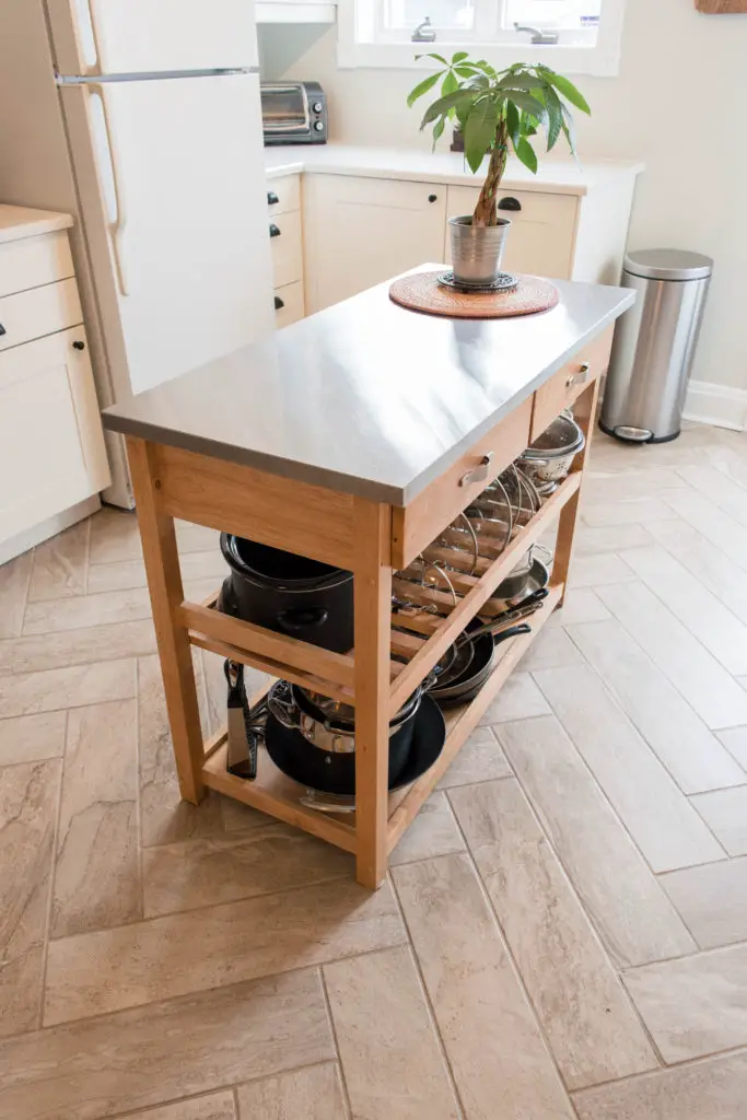
The only thing that we kept from the “old” kitchen was our relatively-new kitchen island. We got it from Target when I first bought the house and it’s style and functionality has kept up quite well in the new space.
In case you haven’t caught on yet – we are extremely pleased with the way our kitchen renovation turned out. What they say is true – updating your kitchen can update the whole house.
Have you remodeled your kitchen? What new features do you love the most? Or are you in the planning stage? If so, what features are you dreaming of? I hope detailing our project has provided you with some insight into the options you have, especially when it comes to working with IKEA cabinets.
